|
Following on from my previous post (about McEwan Hall entrance) here's a picture I took of an (old) University crest attached to a wall on Bristo Square. I'm not sure where this will come into my dissertation (if at all) however I'm adding it here as a reminder, and also because I like the photo. Actually, the ideal place for this would be within the Literature review when I'm talking about Ray Land's reflections on university crests. Perhaps I include the static image alongside the text. Or perhaps I develop it in some animated way. Or both. 
0 Comments
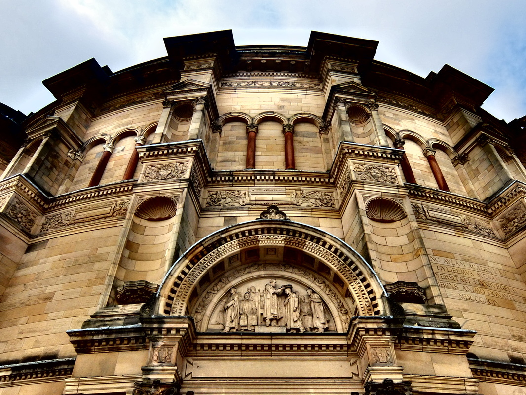
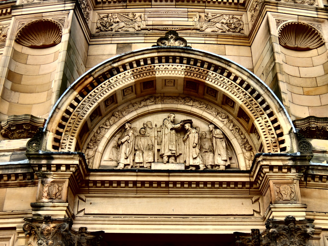
Yesterday morning I wandered over to McEwan Hall where the University graduations were taking place. I took some photos partly to test my camera, but also as a reminder of what I'm missing out on through my lack of recent activity on the dissertation. This was self-punishment for my slow progress.
I wonder however whether an image similar to those above might be useful in a different way? My current thinking for the 'cover photo' for my dissemination website is that the content of the computer screen in the centre of the picture will represent the opening to my work. Clicking on the screen will open the Introduction/Abstract/Background section. Although I had given much though to the final detail of what would be 'showing' on the computer screen, however I loosely imagined that it would clearly signifiy the content that would follow, for instance it could be the abstract or similar on screen text.
An alternative approach is that I could use a photograph of a university entrance way as the entrance to my work. The door/entrance visual metaphor is far from original on websites, however I could offer added meaning by having the image content as specific to my own work: Edinburgh University's entrance as the opening to my ideas about multimodal assessment in the same institution. Further, the image on screen could be in the process of edited so that it goes beyond a static image to a photograph that is alive and an active part of the depicted scene. Could I make the image itself multimodal - perhaps the editing involves adding some text over the image within Photoshop? Maybe this is a bit cliched. It's more interesting than simply text on screen. Yes, what is on screen should be multimodal - to do otherwise would partly contradict my work and the rest of the image of which the computer screen is a part. I'll revisit this at a later date and see if it still stands up. Here's an idea to overcome the difficulty of composing the different representational artefacts in a way that offers a convincing constellation. Rather than using a standard landscape size photo, I could create a panoramic image in order to offer enough canvas space to place all the components in a way that is clear and convincing, as well giving a reasonable chance of presenting a constellation. 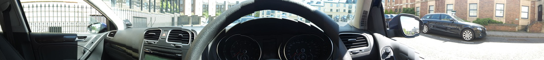 And here's one I created earlier. Obviously I won't be using a VW Golf dashboard. What I need to do next is try and see whether I can create an image of the approximate size and orientation using the 360 function on my camera (as I don't want it to as wide as the above) and then whether this will work in Thinglink.
Hmm. I wonder whether the image will become skewed and I'm actually better off just using a slightly different orientation from the standard portrait. After all, it still has to look like a map. Yeah, maybe that's it. Worth exploring both approaches, though. |
Categories
All
Archives
October 2013
Timeline
Other stuff
|