|
Why should my discussion of the data be purely text-based (as I've had in my head). It should be multimodal. And this goes beyond a the use of enlarged type and so on as purely aesthetic visual effects. It should by critical. Here's an idea, then:
While this has been a useful bit of quick thinking-and-jotting-down, I suspect that I should probably focus on the data and see what types of visual approaches lend themselves to emerging themes, rather than thinking of visual approaches and then trying to find data to match.
0 Comments
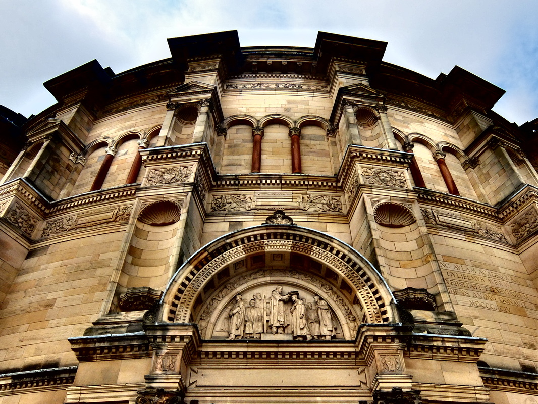
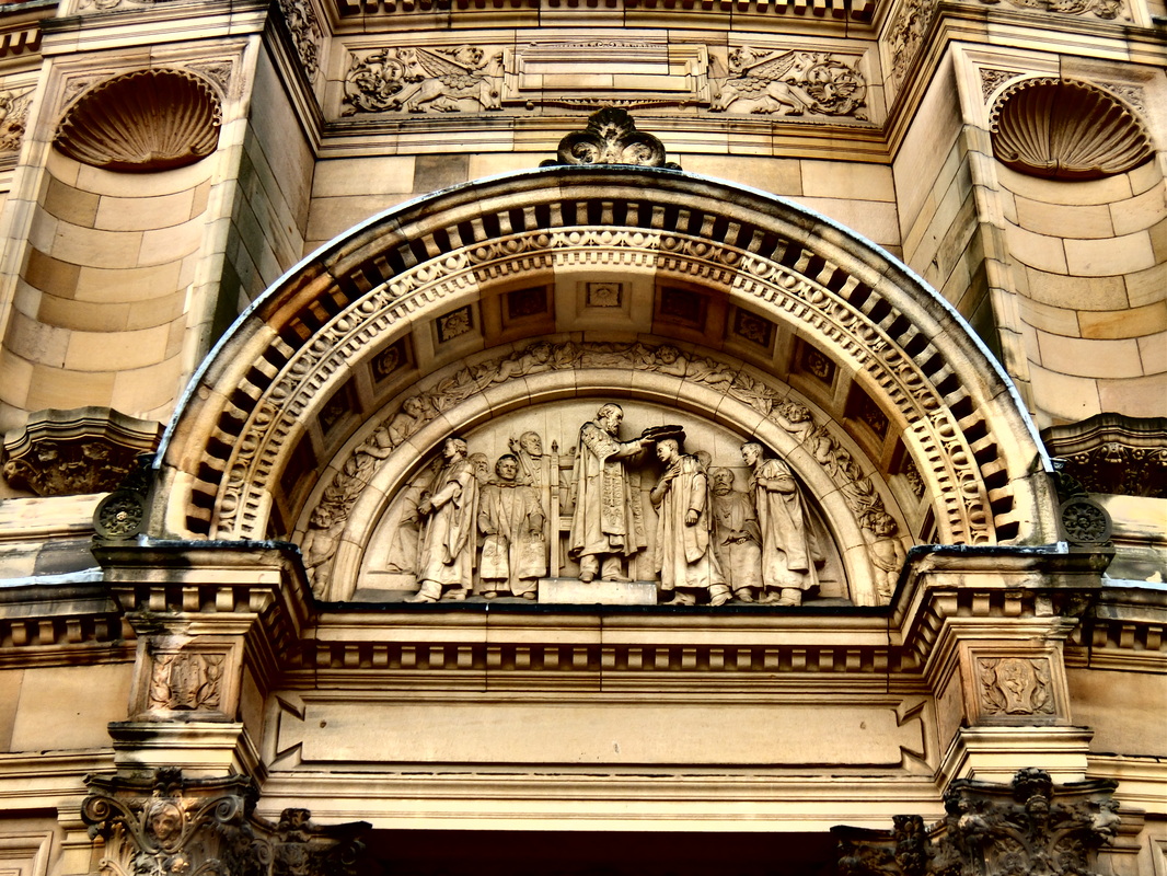
Following on from my previous post (about McEwan Hall entrance) here's a picture I took of an (old) University crest attached to a wall on Bristo Square. I'm not sure where this will come into my dissertation (if at all) however I'm adding it here as a reminder, and also because I like the photo. Actually, the ideal place for this would be within the Literature review when I'm talking about Ray Land's reflections on university crests. Perhaps I include the static image alongside the text. Or perhaps I develop it in some animated way. Or both. 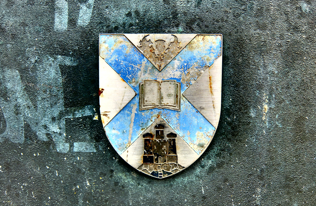 Yesterday morning I wandered over to McEwan Hall where the University graduations were taking place. I took some photos partly to test my camera, but also as a reminder of what I'm missing out on through my lack of recent activity on the dissertation. This was self-punishment for my slow progress.
I wonder however whether an image similar to those above might be useful in a different way? My current thinking for the 'cover photo' for my dissemination website is that the content of the computer screen in the centre of the picture will represent the opening to my work. Clicking on the screen will open the Introduction/Abstract/Background section. Although I had given much though to the final detail of what would be 'showing' on the computer screen, however I loosely imagined that it would clearly signifiy the content that would follow, for instance it could be the abstract or similar on screen text.
An alternative approach is that I could use a photograph of a university entrance way as the entrance to my work. The door/entrance visual metaphor is far from original on websites, however I could offer added meaning by having the image content as specific to my own work: Edinburgh University's entrance as the opening to my ideas about multimodal assessment in the same institution. Further, the image on screen could be in the process of edited so that it goes beyond a static image to a photograph that is alive and an active part of the depicted scene. Could I make the image itself multimodal - perhaps the editing involves adding some text over the image within Photoshop? Maybe this is a bit cliched. It's more interesting than simply text on screen. Yes, what is on screen should be multimodal - to do otherwise would partly contradict my work and the rest of the image of which the computer screen is a part. I'll revisit this at a later date and see if it still stands up. [Glossing over the fact that it's more than a month since my last entry] Here's a image I put together tonight as to how I might compose the image for the front of my dissemination website. My plan is to take a draft photo tomorrow, build the shell of the site and then e-mail the link to Sian in order to get feedback on my structure. No point spending too much time just now on either the image or the site as both will be influenced by Sian's comments. Here's the pic: 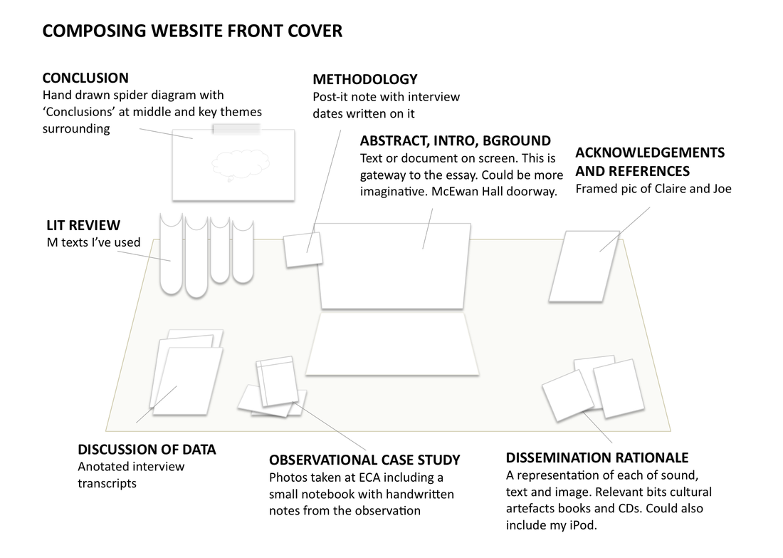 Actually, that looks quite good, although I don't suppose proper designers/photographers do night before mock-ups in PowerPoint. It's multimodal. Maybe I'll include this somehow - whether as image of via hyperlink - within my Dissemination rationale.
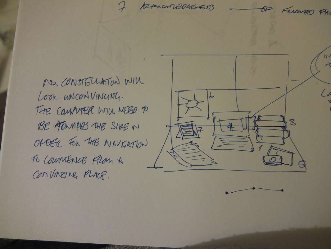
Here's an idea to overcome the difficulty of composing the different representational artefacts in a way that offers a convincing constellation. Rather than using a standard landscape size photo, I could create a panoramic image in order to offer enough canvas space to place all the components in a way that is clear and convincing, as well giving a reasonable chance of presenting a constellation. 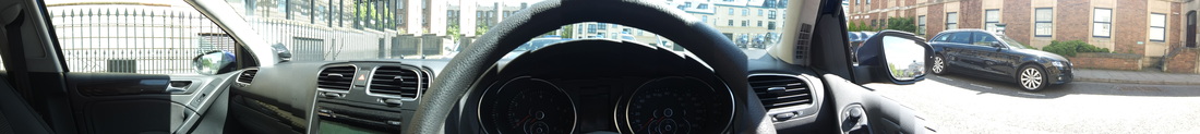 And here's one I created earlier. Obviously I won't be using a VW Golf dashboard. What I need to do next is try and see whether I can create an image of the approximate size and orientation using the 360 function on my camera (as I don't want it to as wide as the above) and then whether this will work in Thinglink.
Hmm. I wonder whether the image will become skewed and I'm actually better off just using a slightly different orientation from the standard portrait. After all, it still has to look like a map. Yeah, maybe that's it. Worth exploring both approaches, though. Some images from my scribbled and sketched notes.
I've spent a lot of time thinking about dissemination. Maybe that's worth reflecting on somewhere in the dissertation itself. If this had been an 'essay' I could have spent days and days more time on 'content' rather than 'form'. But that wouldn't have been as much fun.
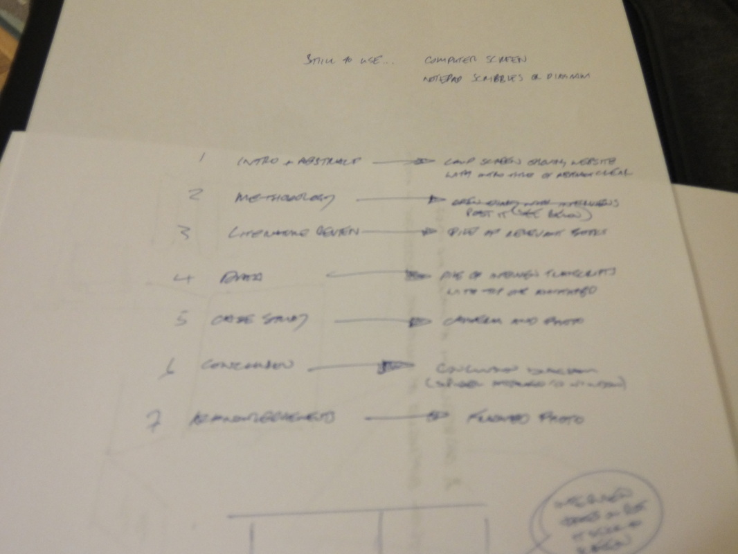
On the way back from Moray House Library earlier today (having returned The Psychology of Everyday Things by Donald Norman) I stopped for a coffee in Caffe Nero and jotted down some ideas for the front cover image. With Michael visiting this weekend and willing to spend some time talking multimodality, it would helpful to have a mock up in place to get his thoughts on. Here then are some thoughts on the possible artefact components that could make up the front cover image for dissemination:
Hmmm. Lacking imagination here. Very repetitive. Maybe I need to take a different approach, focusing on the artefact rather than the component of the website that's being represented.
This is beginning to take shape. It's not perfect, but it's not bad. I'll need to think carefully how I arrange the different items for photographing - I need each component to be clear and for the image to be authentic but not overly cluttered. Maybe I can add some authenticity by including some of the following items into the scene:
That'll do for now. Maybe tomorrow night I'll have a quick go at mocking this up (with some dummy components) before I spend much more time thinking about this.
Struggling to stay away, but throwing this thought down otherwise I might forget it.
My front page on the dissemination: should the constellation be of artefacts that represent sound, word and image, rather than trying to find artefacts that link to particular parts of the dissertation? Or to put it another way, should the image/constellation be reflective specifically of the title (which overlays it) rather than trying to represent all the components of the assignment? Or can it do both? If I decide to go for both (or just focusing on assignment components) then I can justifiably use thinglink. However its a case of simply a case of depicting image, word and sound then there's no point in having hyperlinks. I'd like to stick with the idea (at least) of using the image as a map of the assignment. My challenge then will be to come up with a series of artefacts in the image that simultaneously represent different components of the dissertation whilst in themselves depicting image, word and sound. So the image will have components that could a double meaning e.g. a book might simultaneously depcict the 'words' part of the title, whilst also representing and linking to the literature review. This is going to be tricky. Is this the thirds post I've made about the idea to develop or discuss a multimodal university crest within dissemination. This one came to me late last night. I was quite excited about it then, however not sure about it now. I wish I'd taken time to get up and write a few notes about it at the time: I did reflect that a truly committed scholar would have done so. Anyway, a day later, here's the idea, as much as I can remember it.
As per earlier posts I make the point that, in the multimodal university, the university crest is reimagined to have books alongside other modes or other digital resources. But then in a truly digital multimodal university, perhaps the crest itself would exploit the potential of multimodality itself. It might not be static by animated and accompanied by sound. Actually, that raises a useful point. I could pick up on land's idea and say that the visual depiction of the book within medieval university crests reflects the privileging of the bound text, but actually the crests themselves are multimodal: they have a combination of words, image, design. Learning at the time was multimodal: oral, textual and visual - therefore its fitting that the crests do likewise. Actually, maybe that's the approach I take. I could talk about the multimodal nature of the logos, but point out that of course the oral element is reflected in the crests themselves. This is something however in the digital multimodal university that could be realised. The multimodal university crest would include text* as well as images depicting a number of key modes of communication - but it needn't be static. It could use other modes - sound, animation. *reflecting some of the discussion within multimodal discourse (in particular Kress), perhaps the logo could be entirely visual. Maybe the visual image attains sufficient status in the academy that the logo is entirely visual. Come to think of it, most of this wasn't what I thought of last night, but has been the product of some freewriting just now. Even if the original ideas wasn't that great in the cold light of day, I think I've come up with perhaps a couple of interesting points here. In my last blog entry (where I explored the use visual exploration of the university crest) I made what felt like an important observation about the wider use of image within the dissertation dissemination:
Now that I stop to reflect on my use of image within dissemination, it feels like I've fallen in the trap of ignoring the meaning-sharing value of image, and instead have focused more on it as an aesthetic device. This really feels at odds with the nature of multimodality as described in the literature. In fact, there's a strong argument that my work would look less impressive if I ignore or underestimate the potential of visual images (just as I want to avoid doing the same with music). So then, how can I use image in a way that extends beyond attaching digital wallpaper to the screen background? [A nice phrase that last one - maybe I should include it within my dissemination rationale.]
I could have relevant images alongside or embedded within the text. This would be instead of just long sections of text. They could be used periodically to visually represent what's included in the text. Off the top of my head this could include books, cds of music, videos, art stuff, lap top, written text on the page, writing devices, keyboard, ipad scree with touch keys, Second Life or other digital spaces on a screen. I would photograph all these images, fitting in with the idea that all of this is my own work. Even when referring to someone else's essay on screen (assuming I choose to do this - see earlier blog post) it would be my photograph of what's on screen. I could have a bit of fun with this by being imaginative, humorous and including secondary subtle or subliminal messages into the image, for instance in the choice of books, CDs or DVDs, or through the selection of artefacts in the background. Would I need to caption them underneath the image? Maybe. Maybe I could use the hover over text. Would I need to offer a citation under or alongside the image? Maybe this wouldn't be necessary if it's all my own work and such is explained within an introductory section. Or again, maybe when when the cursor hovers over the image a title and my name appears. Another approach - and this might be edging more towards the visual aesthetic side of thing - but I could use 'talking' icons alongside sections of quoted text in my data analysis. Hmm, need to think more about this one. Could be interesting, could be sh*t. What I've proposed above represents using images that support and help to explain what's being said in accompanying text. But how can I use image to really offer greater meaning in it's own right? Perhaps that's where I create/compose/picture something specifically for the purpose of exploring an idea rather than supporting the text. An example would be the university crest. I'm not sure I can think of any others at this stage and it doesn't make sense to try and generate images before I've actually analysed the data and drawn my own conclusions. Instead, once the text is drafted for the dissemination I should read through it and see where image might be relevant or useful or enhance what it written down. |
Categories
All
Archives
October 2013
Timeline
Other stuff
|