|
This won't be a video. I don't have the time to do it justice. Instead, I'll take photographs of university crests (containing a book) and will put them into a rolling slideshow, as I've just been testing out for the Observation section... If time allows, perhaps I could still try to create a single crest that is more multimodal (or digitally multimodal). That would be quite interesting.
Or perhaps I re-form one or more of the original crests to represent the multimodal university? Again though, I need to be conscious of time so this idea is probably unrealistic.
0 Comments
Another helpful e-mail from Sian:
So there you go! Land's work on crests....was Sian's work.
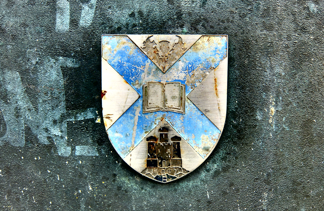
Following on from my previous post (about McEwan Hall entrance) here's a picture I took of an (old) University crest attached to a wall on Bristo Square. I'm not sure where this will come into my dissertation (if at all) however I'm adding it here as a reminder, and also because I like the photo. Actually, the ideal place for this would be within the Literature review when I'm talking about Ray Land's reflections on university crests. Perhaps I include the static image alongside the text. Or perhaps I develop it in some animated way. Or both.
Is this the thirds post I've made about the idea to develop or discuss a multimodal university crest within dissemination. This one came to me late last night. I was quite excited about it then, however not sure about it now. I wish I'd taken time to get up and write a few notes about it at the time: I did reflect that a truly committed scholar would have done so. Anyway, a day later, here's the idea, as much as I can remember it.
As per earlier posts I make the point that, in the multimodal university, the university crest is reimagined to have books alongside other modes or other digital resources. But then in a truly digital multimodal university, perhaps the crest itself would exploit the potential of multimodality itself. It might not be static by animated and accompanied by sound. Actually, that raises a useful point. I could pick up on land's idea and say that the visual depiction of the book within medieval university crests reflects the privileging of the bound text, but actually the crests themselves are multimodal: they have a combination of words, image, design. Learning at the time was multimodal: oral, textual and visual - therefore its fitting that the crests do likewise. Actually, maybe that's the approach I take. I could talk about the multimodal nature of the logos, but point out that of course the oral element is reflected in the crests themselves. This is something however in the digital multimodal university that could be realised. The multimodal university crest would include text* as well as images depicting a number of key modes of communication - but it needn't be static. It could use other modes - sound, animation. *reflecting some of the discussion within multimodal discourse (in particular Kress), perhaps the logo could be entirely visual. Maybe the visual image attains sufficient status in the academy that the logo is entirely visual. Come to think of it, most of this wasn't what I thought of last night, but has been the product of some freewriting just now. Even if the original ideas wasn't that great in the cold light of day, I think I've come up with perhaps a couple of interesting points here. A not particularly convincing thought that I had on the way home this evening:
How about including a visual of the multimodal university crest within the lit review, rather than just talking about it. After all, this is intended to be a multimodal artefact, therefore when proposing that the digital university in the future might need to rethink its crest, why should I stop at text? Certainly, this isn't conventional. But then the dissemination itself is following a non-traditional route therefore why not? It needn't be a significant focus of discussion, however maybe when proposing such a crest, maybe I have the image embedded into the section of text. It would be pretty obvious what I'm talking about therefore I wouldn't need to really explain in any great detail what's going on within the graphic. In fact this raises a wider and interesting point: how much use should I be making of images within my text? Thus far my thinking has simply been along the lines of 'signifier' images at the top or bottom of pages. But surely I'm missing something here. Should I not have images punctuating the text through the document (or at least, certain sections where it lends itself to that kind of thing)? This feels like a significant issue therefore I going to explore it within a dedicated blog post to follow. Meanwhile however, back to the multimodal university crest. The multimodal university crest could be a combination of books alongside other modes, representing the fact that ideas are now represented across a range of modes within the academy. In fact maybe I could include a few different options. Maybe there's almost a case for coming up with a visual exploration of how the university crest might look in the future/or how it might look at the current time according to the literature. Perhaps this could become a dedicated section of the dissertation: perhaps I could even offer a few different versions, based upon different themes within the literature of different viewpoints e.g. 'here's a crest built around multimodality as defined by Kress and van Leewen which replaces the book instead with a canvas, upon which a range of artefacts have been painted (and this could include some painted letter and other modes).' Maybe this is getting a bit ambitious? Probably. Maybe I'm overplaying it a bit. Nevertheless, I think there's something here. Contrary to what I said above about almost introducing the image in an understated way, perhaps on the contrary I should do this is in more detail, and make a case for doing so. I could say that we, consistent with the significant role of image within multimodality, when exploring how the university crest might be reimagined it is vital to do so with the use of image, rather than relying solely on text. And thereafter I have a mixture of text discussion alongside the image. And here's a good idea - once I've created the crest, I could use it in an explicit or subtle way (or ways) within the cover image on the website. For instance perhaps the crest would be on screen as part of a mock up of a university website? Or maybe the logo would be on some form of stationery (an academic diary?) or a piece of tat to which university crests are typically attached. Maybe some form of paper weight or something like that. Or maybe - and this is perhaps a bit better - on the front cover of an official-looking assessment handbook. There are some interesting ideas here, not least that I'm now reappraising the role that image might play within dissemination. |
Categories
All
Archives
October 2013
TimelineOther stuff
|


