|
On the way back from Moray House Library earlier today (having returned The Psychology of Everyday Things by Donald Norman) I stopped for a coffee in Caffe Nero and jotted down some ideas for the front cover image. With Michael visiting this weekend and willing to spend some time talking multimodality, it would helpful to have a mock up in place to get his thoughts on. Here then are some thoughts on the possible artefact components that could make up the front cover image for dissemination:
Hmmm. Lacking imagination here. Very repetitive. Maybe I need to take a different approach, focusing on the artefact rather than the component of the website that's being represented.
This is beginning to take shape. It's not perfect, but it's not bad. I'll need to think carefully how I arrange the different items for photographing - I need each component to be clear and for the image to be authentic but not overly cluttered. Maybe I can add some authenticity by including some of the following items into the scene:
That'll do for now. Maybe tomorrow night I'll have a quick go at mocking this up (with some dummy components) before I spend much more time thinking about this.
0 Comments
Struggling to stay away, but throwing this thought down otherwise I might forget it.
My front page on the dissemination: should the constellation be of artefacts that represent sound, word and image, rather than trying to find artefacts that link to particular parts of the dissertation? Or to put it another way, should the image/constellation be reflective specifically of the title (which overlays it) rather than trying to represent all the components of the assignment? Or can it do both? If I decide to go for both (or just focusing on assignment components) then I can justifiably use thinglink. However its a case of simply a case of depicting image, word and sound then there's no point in having hyperlinks. I'd like to stick with the idea (at least) of using the image as a map of the assignment. My challenge then will be to come up with a series of artefacts in the image that simultaneously represent different components of the dissertation whilst in themselves depicting image, word and sound. So the image will have components that could a double meaning e.g. a book might simultaneously depcict the 'words' part of the title, whilst also representing and linking to the literature review. This is going to be tricky. Is this the thirds post I've made about the idea to develop or discuss a multimodal university crest within dissemination. This one came to me late last night. I was quite excited about it then, however not sure about it now. I wish I'd taken time to get up and write a few notes about it at the time: I did reflect that a truly committed scholar would have done so. Anyway, a day later, here's the idea, as much as I can remember it.
As per earlier posts I make the point that, in the multimodal university, the university crest is reimagined to have books alongside other modes or other digital resources. But then in a truly digital multimodal university, perhaps the crest itself would exploit the potential of multimodality itself. It might not be static by animated and accompanied by sound. Actually, that raises a useful point. I could pick up on land's idea and say that the visual depiction of the book within medieval university crests reflects the privileging of the bound text, but actually the crests themselves are multimodal: they have a combination of words, image, design. Learning at the time was multimodal: oral, textual and visual - therefore its fitting that the crests do likewise. Actually, maybe that's the approach I take. I could talk about the multimodal nature of the logos, but point out that of course the oral element is reflected in the crests themselves. This is something however in the digital multimodal university that could be realised. The multimodal university crest would include text* as well as images depicting a number of key modes of communication - but it needn't be static. It could use other modes - sound, animation. *reflecting some of the discussion within multimodal discourse (in particular Kress), perhaps the logo could be entirely visual. Maybe the visual image attains sufficient status in the academy that the logo is entirely visual. Come to think of it, most of this wasn't what I thought of last night, but has been the product of some freewriting just now. Even if the original ideas wasn't that great in the cold light of day, I think I've come up with perhaps a couple of interesting points here. In my last blog entry (where I explored the use visual exploration of the university crest) I made what felt like an important observation about the wider use of image within the dissertation dissemination:
Now that I stop to reflect on my use of image within dissemination, it feels like I've fallen in the trap of ignoring the meaning-sharing value of image, and instead have focused more on it as an aesthetic device. This really feels at odds with the nature of multimodality as described in the literature. In fact, there's a strong argument that my work would look less impressive if I ignore or underestimate the potential of visual images (just as I want to avoid doing the same with music). So then, how can I use image in a way that extends beyond attaching digital wallpaper to the screen background? [A nice phrase that last one - maybe I should include it within my dissemination rationale.]
I could have relevant images alongside or embedded within the text. This would be instead of just long sections of text. They could be used periodically to visually represent what's included in the text. Off the top of my head this could include books, cds of music, videos, art stuff, lap top, written text on the page, writing devices, keyboard, ipad scree with touch keys, Second Life or other digital spaces on a screen. I would photograph all these images, fitting in with the idea that all of this is my own work. Even when referring to someone else's essay on screen (assuming I choose to do this - see earlier blog post) it would be my photograph of what's on screen. I could have a bit of fun with this by being imaginative, humorous and including secondary subtle or subliminal messages into the image, for instance in the choice of books, CDs or DVDs, or through the selection of artefacts in the background. Would I need to caption them underneath the image? Maybe. Maybe I could use the hover over text. Would I need to offer a citation under or alongside the image? Maybe this wouldn't be necessary if it's all my own work and such is explained within an introductory section. Or again, maybe when when the cursor hovers over the image a title and my name appears. Another approach - and this might be edging more towards the visual aesthetic side of thing - but I could use 'talking' icons alongside sections of quoted text in my data analysis. Hmm, need to think more about this one. Could be interesting, could be sh*t. What I've proposed above represents using images that support and help to explain what's being said in accompanying text. But how can I use image to really offer greater meaning in it's own right? Perhaps that's where I create/compose/picture something specifically for the purpose of exploring an idea rather than supporting the text. An example would be the university crest. I'm not sure I can think of any others at this stage and it doesn't make sense to try and generate images before I've actually analysed the data and drawn my own conclusions. Instead, once the text is drafted for the dissemination I should read through it and see where image might be relevant or useful or enhance what it written down. A not particularly convincing thought that I had on the way home this evening:
How about including a visual of the multimodal university crest within the lit review, rather than just talking about it. After all, this is intended to be a multimodal artefact, therefore when proposing that the digital university in the future might need to rethink its crest, why should I stop at text? Certainly, this isn't conventional. But then the dissemination itself is following a non-traditional route therefore why not? It needn't be a significant focus of discussion, however maybe when proposing such a crest, maybe I have the image embedded into the section of text. It would be pretty obvious what I'm talking about therefore I wouldn't need to really explain in any great detail what's going on within the graphic. In fact this raises a wider and interesting point: how much use should I be making of images within my text? Thus far my thinking has simply been along the lines of 'signifier' images at the top or bottom of pages. But surely I'm missing something here. Should I not have images punctuating the text through the document (or at least, certain sections where it lends itself to that kind of thing)? This feels like a significant issue therefore I going to explore it within a dedicated blog post to follow. Meanwhile however, back to the multimodal university crest. The multimodal university crest could be a combination of books alongside other modes, representing the fact that ideas are now represented across a range of modes within the academy. In fact maybe I could include a few different options. Maybe there's almost a case for coming up with a visual exploration of how the university crest might look in the future/or how it might look at the current time according to the literature. Perhaps this could become a dedicated section of the dissertation: perhaps I could even offer a few different versions, based upon different themes within the literature of different viewpoints e.g. 'here's a crest built around multimodality as defined by Kress and van Leewen which replaces the book instead with a canvas, upon which a range of artefacts have been painted (and this could include some painted letter and other modes).' Maybe this is getting a bit ambitious? Probably. Maybe I'm overplaying it a bit. Nevertheless, I think there's something here. Contrary to what I said above about almost introducing the image in an understated way, perhaps on the contrary I should do this is in more detail, and make a case for doing so. I could say that we, consistent with the significant role of image within multimodality, when exploring how the university crest might be reimagined it is vital to do so with the use of image, rather than relying solely on text. And thereafter I have a mixture of text discussion alongside the image. And here's a good idea - once I've created the crest, I could use it in an explicit or subtle way (or ways) within the cover image on the website. For instance perhaps the crest would be on screen as part of a mock up of a university website? Or maybe the logo would be on some form of stationery (an academic diary?) or a piece of tat to which university crests are typically attached. Maybe some form of paper weight or something like that. Or maybe - and this is perhaps a bit better - on the front cover of an official-looking assessment handbook. There are some interesting ideas here, not least that I'm now reappraising the role that image might play within dissemination. Another quick thought over lunch and something which came to me during the previous post about potentially including images of EDC work within the lit review. I need to think about how I use image within the web essay so that it becomes an integral part of the representation of ideas, and not just to make the thing look nice (although that's helpful too). Here then is a very quick bit of brainstorming on how I might use images in the web essay (and not all of these are new ideas):
In what way have I attempted to use image in a way that goes beyond purely the aesthetic? How does it contribute towards the communication of meaning and the audience experience?
While I will almost certainly return to this, I think it has been a useful exercise in reminding me to stop and think 'Why am I doing this' and not to get immersed in the visual side of things beyond the potential value it might offer. I should probably do a similar exercise for audio. Here's an interesting idea. Maybe when I'm thinking about the structure of the website for dissemination, I could explore its shape using by laying out a constellation. The constellation form would in turn then be used to influence the layout of artefacts on the image that will form the front cover. I've included this image as an example and reminder that a constellation doesn't need to be a single line: it can break off in different directions. So for instance if I want to have several sections devoted towards 'Data findings and discussion' within what might be half way point of the structure of the essay, this would be shown by lines breaking out from the the central line of the constellation. 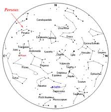 This is just a note to revisit an earlier idea a had, which I was reminded of during Ray Land's presentation at the e-Learning@edinburgh conference last Friday. The following is drawn from my own notes taken during the presentation:
I could acknowledge Land's view here, making the point that the development of the Harvard university crest can be seen as representing the way that the book is longer the sole means of learning - it is part of the digital educational landscape.
I wonder whether I could include this as part of a discussion of how university crests might be reimagined to reflect the multimodal nature of learning. I touched on this within my EDC assignment. This could come within the historical section of my literature review. It needn't be lengthy. I could make the point that the Land draws our attention to the Harvard University crest as a recognition of the way that the digital influences our learning resources. The historical dominance of the bound text within higher education can be seen in the presence of books within university crests of the ancient mediaevel Western Universities. But as the digital has reshaped learning so these crests have been altered to reflect the new ways. Up to this point I'm not saying anything new. However I could move beyond this to suggest that the visual strapline accompanying the old crest implies could be seen as reflecting the continued dominance of the book, or perhaps a reticence to move away from the certainties of traditional authorship and learning. Perhaps in the future the university crest itself might truly embrace multimodality with a visual representation of new ways of communicating ideas. Nevertheless, the proposed shift from page to screen is sometimes acknowledged, but not genuinely reflected symbolically in crests. Hmmm. Is this appropriate for the literature review. I like the idea but maybe I'm wandering off towards speculation? Over lunch, some quick thoughts on the constellation image to go on the front cover of my web essay for dissemination.
The front cover will be dominated by an image. The image will depict a study-related scene. The study-related scene will include a range of different artefacts. Each artefact will represent a different section of the web-essay. The pictured artefacts could include the following: a pile of books to represent references a camera including printed out photographs (of ECA observation) to represent observation a Skype interview on screen to represent data collection Other sections of the essay that will need to have a depicting image, including: introduction methodology background discussion of findings conclusion Other study related artefacts within the image could include: CDs, ipod etc to represent the sound element. Maybe a CD that matches the nature of the research pens, pads, post it notes and other study-related tools coffee mug. Perhaps there's a Penguin mug that matches the subject matter. an assessment handbook Some other thoughts: the depicting image will also appear as a signifier at the top of each page images will also be used at the bottom of each page for navigation I imagine the image being realised in grey and white with a constellation over the top of it it will be interesting to think about whether the image could be created in another application and embedded into the html of the page, in a way that would enable particular hot spots or text to appear - could I embed a thinglink with links to the different pages of the web essay? I like this idea. At the moment I'm unconvinced of the value of carrying out visual data collection. To be honest, I've never been totally sold on the idea, but then I've never tried my hand at this kind of thing therefore maybe that's to be expected. When I'm already hard pushed to submit my dissertation by the 'early' August deadline that I've set, this would seem to be an exercise that will be time consuming beyond the merit that I can see it providing.
As a newcomer to visual research I'll obviously need to do some research into how it should be done. And having never carried out this visual analysis, there's no guarantee that I'll be any good at it. Even if it does prove to be something I am able to do effectively, how much value would a handful of images add to the project? This is all over-and-above determining what I data I'm trying to collect and that actually collecting it. Might I not have sufficient data with the seven interviews followed by observation? Although this is something that Sian is keen for me to try (on the basis that she thinks I'd be good at it).. So I have two key questions/concerns (over and above whether I'll be any good at visual analysis):
|
Categories
All
Archives
October 2013
Timeline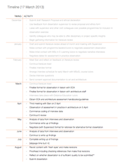
Other stuff
|